Quintel Blogger theme

A free Premium Blogger theme.

Showing posts with label popular culture. Show all posts

Tuesday, March 5, 2013

A Whimsical Water Tower in...Barcelona?


I spotted this fantastic water tower the other day while walking around Poble Nou, Barcelona's industrial graveyard. Claes Oldenburg and Coosje van Bruggen (authors of a major public sculpture in this city) could not have done a better job than this. I mean, you just gotta love that corrugation detail! Judging by the looks, it seems to be a relic from a defunct cardboard box manufacturer whose logo was the Star of David, no less.


Having grown up in Montreal, I was instantly reminded of that city's famous Guaranteed Pure Milk Company water tower. But then North American cities are places one would expect to find these kinds of quirky pop-constructions (the Orange Julius, a chain of roadside juice stands in the form an orange, is Montreal's answer to a Las Vegas duck). Barcelona, on the other hand, is not the first place that comes to mind when it comes to NON-pedigreed architectural whimsy, so it is very endearing indeed to stumble across something like this in my adopted hometown.


Monday, December 5, 2011

Collective Intelligence, or Collective Stupidity?


Detroit?  Bangkok?  Manila?  Manaus?  South Africa? 

The above image is circulating on the internet accompanied by all sorts of captions of all sorts of cities on all sorts of continents, showing us how images, so easily appropriated and manipulated today, are deployed toward all sorts of ends, all too often sensationalist, demagogical, and misleading.


According to "Del Tirador a la Ciudad", the architecture and design blog of El País, this image is of Detroit, Michigan. Last time I visited Detroit, in 2001, there weren't any palm trees to be found, but who knows, maybe global warming has somewhat altered the flora of the Motor City over the last decade.


I suspect the author, Anatxu Zabalbeascoa, pulled the image from this post at Decrece Madrid, a grassroots environmentalist, anti-consumerist and anti-capitalist organization in Madrid calling for the "degrowth" of that metropolis. 


In both of the above websites, this image of "Detroit" serves to highlight the built manifestation of extreme socio-economic contrast, which is certainly visible in this image, and which can certainly be seen in parts of Detroit. Except that this isn't Detroit. Poverty in that city actually looks very different, occupying run-down 19th and early 20th century houses originally built for a white middle class that fled to the suburbs in the 1950s and 60s.


A reverse image search (conducted by talented architect and photographer Manca Ahlin) reveals a list of further cities which this image supposedly represents: Manila, Manaus, South Africa and Bangkok.


Is this collective intelligence, or is this collective stupidity? You can take your pic(k).

Saturday, March 26, 2011

Pop Architecture


Ordinary, everyday objects--that's what most architectural sobriquets refer to. A gherkin, a paperclip, a typewriter, a stapler, mushrooms, milk cartons, cereal boxes, dildos... These kinds of endearing associations create a pop-cultural world parallel to Claes Oldenburg and Coosje van Bruggen's, whose inflated, oversized banal objects are exactly what the "untrained eye" seems to see in many buildings.


"La macchina per scrivere" (the typewriter), Rome.


"La grapadora" (the stapler) by MBM, Barcelona


"De paperklip" (the paper clip) by Carel Weeber, Rotterdam.


"Las setas" (the mushrooms) by Jürgen Mayer H., Seville.


"El tampax" (the tampon), by Toyo Ito, Barcelona


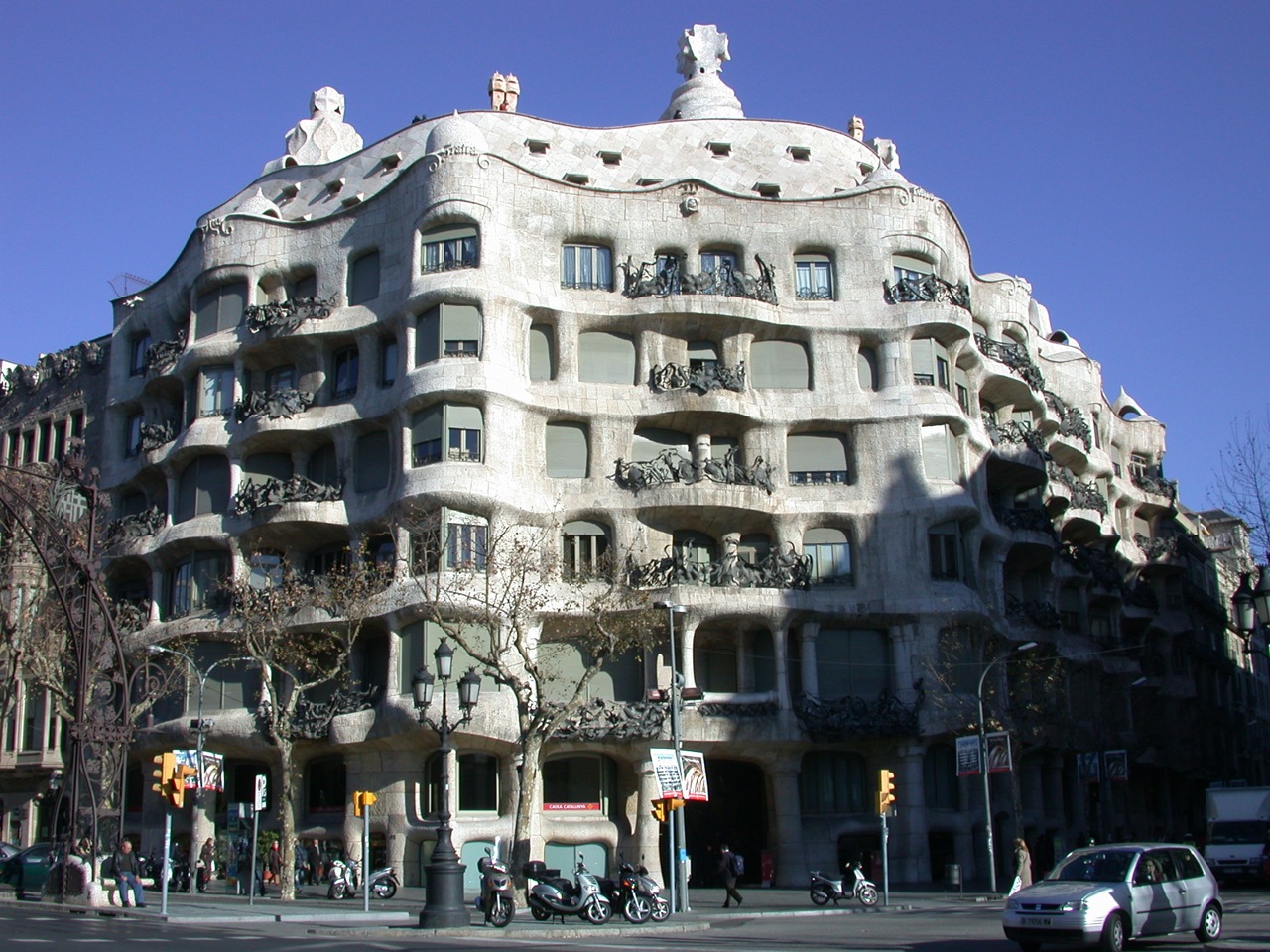
"La pedrera" (the stone quarry) by Antoni Gaudí, Barcelona.


La colmena (the beehive), by Taller de Arquitectura, Barcelona


La gasolinera (the gas station), by Viaplana, Piñon, Miralles, Barcelona


"The gherkin" by Foster, London


La râpe à fromage (cheese grater), Roger d'Astous & Jean Paul Pothier, Montreal


La chute à linge (laundry chute) by Moshe Safdie, Montreal (photo courtesy nwaonline.com)


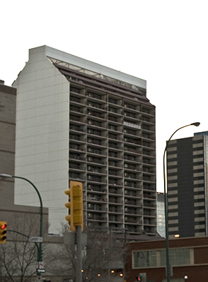
One of many "milk cartons" by IKOY, Winnipeg


"El Toblerone", Almería. Image courtesy salvemoseltoblerone.org


Friday, December 25, 2009

Holiday greetings


Vienna, 2009

Thursday, August 6, 2009

Visitant / Local II


"The beach is the only space of enjoyment that humans have found in nature." - Henri Lefebvre


Thursday, May 14, 2009

W: what is it good for?


A building has been going up--or did it come from outer space?--on Barcelona's Sant Sebastià Beach that is popularly refered to as "Hotel Vela" (sail hotel), but whose commercial name is actually Hotel W Barcelona. That's right: W, as in Dubya. Just what has ex-president George Bush II got to do with this hotel? Probably nothing, since he's in the oil-and-war business. But it seem ironic that the name of this hotel would inadvertently honor the most despised US president ever: this building is turning out to be the most despised new construction in Barcelona since work began several centuries ago on the Citadel.


And just as the atrocities committed by Bush junior and his band of inept cronies prompted all sorts of protest, resistance and terrorism movements throughout the world, this building has similarly given rise to an anti-hotel neighborhood group that organizes events such as this one


as well as a Facebook group called GAHV: Grup Anti Hotel Vela Barceloneta (Anti Hotel Vela Barceloneta Group) with over 500 members.


The reason the building is despised is obvious enough: it is a huge, pretentious, malproportioned and unsightly behemoth that casts a shadow on Barcelona's most frequented and beloved public space: the beach. It is situated only meters from the coastline, which together with its unprecedented height means it can be seen from just about anywhere in the metropolitan area. In short: it is a big fat pig of a building whose curving profile resembles a beer belly more than it does a sail. Oh, did I mention that the building is plain ugly?


What everyone is perplexed about is this: why was there no public consultation process or environmental assessment before permission was granted for this project, and why was it exempted from Spanish coastal setback laws?


There is little that can be done at this point about Hotel W, save throw a bomb at it. Let it serve instead, for the many architecture students that visit Barcelona, as a perfect example of how definitely NOT to situate, proportion, or design a building--just as Dubya's presidency serves as an example of how NOT to run a nation. As with any done deal, one has no choice but to make the best of it.

Sunday, May 10, 2009

It Came from Outer Space


Some buildings are built from the ground up, while others are flown to their site and lowered from the air with the help of aliens and flying saucers. This hotel in Barcelona's Raval neighbourhood is an example of the latter. Before it was lowered into place, the ground had to be cleared of obstacles (buildings, inhabitants, etc.)...for safety, of course. This part took the longest, as there was one neighbour who resented having to make way for progress. But once he was gone, it didn't take very long for this building to make its magical appearance on the cleared slate, er site.

It happened one night during an important Barça game, when nobody was on the street. There was barely any noise, only a few strange lights, and voilà. As soon as the building was gently lowered to the ground, the spaceship was gone. Some workers tightened a few bolts, connected some cables and pipes, and that was it. Oh, shortly before the hotel opened, there was one last clean-up operation: a police round-up of suspected delinquents in the Raval whose activities had been repeatedly denounced throughout many years by residents.

The hotel has been around for over a year now. At night, its red lights pay homage to the prostitution trade that flourishes in the area, in spite of efforts by the authorities to the contrary. Thanks to these generous aliens, and the collaboration of friendly monsters, the Raval is now hipper and safer.


Benches placed by the Ajuntament de Barcelona for gazing at this object from (its) outer space.

Wednesday, April 1, 2009

Everyday Camouflage in "The Visitor"


The story told by Tom McCarthy in his highly commendable film The Visitor, which deals, among other things, with the issue of illegal immigration in post 9/11 USA, unfolds in part in and around a Queens, New York, detention center that is a perfect example of everyday camouflage.

In The Visitor, a recently widowed and disillusioned university professor named Walter Vale (Richard Jenkins) befriends, through unexpected circumstances, a young Syrian named Tarek (Haaz Sleiman), who is arrested one day and sent to a detention center operated by the sinister "United Correctional Corporation". When Tarek's mother Mouna (Hiam Abass) shows up at Walter's door some days later worried about her son, Walter takes her to Queens so she can see where her son is being detained. Walter and Mouna stop across the street from the detention center, and the following dialogue ensues:

WALTER: That’s it.
MOUNA: This is where the prison is?
WALTER: Yes. That’s it.
MOUNA: It does not look like a prison.
WALTER: I think that’s the point.

The dialogue reveals the insidiousness of everyday comouflage perfectly.

Tuesday, March 17, 2009

Us and Theme

If Venice, the Wild West, or Asia can be themes for parks, casinos, or hotels, then why not contemporary architecture? "Theming" has, after all, been a part of architecture for quite some time, as the interesting collection of essays Variations on a Theme Park, edited by Michael Sorkin (New York: The Noon Day Press, 1992), makes evident. Even Hadrian's Villa in Tivoli can be seen as a theme park of sorts, so architecture is on some level intrinsically bound with the very idea of theming.


What is significant about Hotel Puerta de América in Madrid, in which each of its 14 levels is by a different architect or designer, is that it is a theme hotel whose theme is precisely contemporary architecture and design. Of course, merely having interiors on different floors designed by different architects or designers does not necessarily a theme hotel make. What makes Hotel Puerta de América one is the fact that clients choose which designer they would like to sleep with when they make a reservation.


In most hotels, choice is normally limited to amenities, degree of luxury or size. But here, the design--specifically the designer--becomes the object of choice.


There are lots of theme hotels designed by well-known architects and designers. But the themes of these hotels are "Santa Fe" or "Swan Lake": the architecture may be themed, but the theme in such cases is not architecture itself.


Curiously, the Hotel Puerta de América does not bill itself as a theme hotel. The word "theme" is absolutely nowehere to be found in the hotel's promotional literature or on its website. The prices are also quite a bit higher than a "normal" theme hotel. Perhaps this explains why.


Oh, in case anyone is wondering, the rooms with the highest occupancy rate are Zaha Hadid's.

Wednesday, November 26, 2008

Lighten-Up in the Mies Pavilion


The installation by SANAA (Kazuyo Sejima and Ryue Nishizawa) at Barcelona's Mies van der Rohe Pavilion is simple, subtle, and surprising. And irreverent.


A single curving wall comprised of sheets of transparent acrylic winds around the pavilion's interior, creating a nearly invisible circular space. At first glance we might think of it as "Richard Serra Extra-Lite", but in fact this work is not about its own material presence, but about subtly, playfully and irreverently distorting our perception of this most canonical of Modernist buildings. If the Mies Pavilion is already a play of reflections, this adds another, radically different, layer of reflection.


The plan of the installation is a very loosely formed spiral (the symbol of pataphysics), reminiscent of the kind of shape that is often gesticulated by means of a pointer over a map by coaches, war strategists or architects. The work has a sort of spontaneity to it, perhaps due to the flimsiness and imperfect joints of the acrylic sheets. It appears not to have been overly labored, perhaps not even designed. With those oh-so kawaii rabbit chairs in there as well, I wonder if the installation might not just be trying to tell us to "lighten up!" If so, then I wish to second that emotion.


The Mies Foundation should also be congratulated for expanding the program of the pavilion beyond being merely a museum of itself.

Sunday, November 2, 2008

Welcome to the Hotel Barcelona

In case anyone hasn’t noticed, Barcelona is in the tail-end of a hotel construction boom. And Barcelona being “Barceloooooonaaaaaa” means, of course, that these have to be designer hotels. Designery types such as Richard Rogers, Dominique Perrault, Carlos Ferrater, Oriol Bohigas, Juli Capella, Enric Ruiz Geli, Oscar Tusquets, and Ricardo Bofill (to name only some) all have a four- or five-star hotel in the works if not recently completed.


Interestingly, a number of new hotels are high-rise point-towers à la Benidorm, which is not in itself a bad thing since the city has nowhere to grow except in height. But others are being built in some rather questionable areas. One new hotel has recently been built on the side of Montjuïc hill, a public park of historical importance in which the construction of new buildings is strictly prohibited. It is painted dark green in a pathetic attempt to blend in with the hill’s vegetation; yet another example of what I have termed "everyday camouflage" (see Lotus International #126). Another hotel—an embarrassingly awful clone of the Burj al Arab Hotel in Dubai—is going up right at the edge of the sea, another non-buildable zone. One can’t help but wonder if the city isn’t making some very special concessions to hotel developers. Perhaps that is why the Ajuntament (City Hall) launched the advertisement campaign “Visc(a) Barcelona”, some months ago; a wordplay that in Catalan that means both “I live in Barcelona” and “long live Barcelona!” This latest campaign is obviously aimed at making residents proud to be living in a city well on its way to having the most hotel rooms per capita next only to Las Vegas.


Now I’m thinking to myself: this could be heaven or this could be hell.


Fine, but what does this mean for architecture? Well, for one thing it means that the hotel is possibly eclipsing the museum as architecture’s favorite building type. When designing a hotel, an architect can show off their talent much more than with a museum, since one can design a whole way of life from the building itself down to the toilet paper dispenser. When designing a museum, an architect must restrain herself from upstaging the art, but a hotel is an architect’s wet dream: a chance to do a work of "total design"; to control absolutely every aspect of the life lived inside. The fact that people usually only inhabit hotels for a relatively short period of time makes total design tolerable, even attractive. Hey, it might even be fun to try out a totally designed environment for a holiday experience. Architecture, once the stuff of Grand Tours and now that of global media events, has always been better suited to tourism, travel and temporary inhabitation than to dwelling, Being, or everyday life. Perhaps we can say that architecture has finally found its true "home".


Hal Foster, in his incisive book Design and Crime (and other diatribes), argues that, not unlike the turn of the last century, around the time that Adolf Loos published “Ornament and Crime”, we have once again entered an era of total design, one that he terms “Style 2000.” Perhaps Foster was responding to Mark Wigley, who asks in Harvard Design Magazine #5 “Whatever Happened to Total Design?” In any case, the hotel has eclipsed the home as the locus of total design today. Loos's "poor little rich man's home" is today the poor little rich man’s home away from home.


They’re living it up at the Hotel Barcelona. Such a nice surprise. Bring your alibis.

Thursday, October 9, 2008

Architecture in Fashion

Mannequin supporting a representation of the Expo Zaragoza Bridge Pavilion (by Zaha Hadid Architects) in a Zaragoza window display.

Saturday, October 1, 2005

The pursuit of pleasure by the most efficient available means: the urbanism of Benidorm, Spain


Benidorm is a city in southeastern Spain with an urban morphology that is highly unusual for Europe: it is a city of point towers. From a distance, it resembles an American downtown or a new Asian city, with hundreds of tall, slender buildings wedged between arid, semi-desert hills and sparkling sea. From the A-7 highway, which runs the entire length of the highly built-up Mediterranean coast of Spain from the French border to the southernmost tip of the Iberian peninsula, the apparition of Benidorm manages to produce surprise and confusion even after passing through much larger cities such as Barcelona and Valencia.


Benidorm began to develop its urbanism of point towers in the 1960s, when it was transformed from a small fishing village into a major holiday destination for northern Europeans, and, significantly, when the modernist high-rise apartment ‘slab’ was still de rigueur worldwide among architects, planners and mayors. Seen in this historical context, Benidorm prognosticates the demise of the modernist slab and the current growth of the point tower as the preferred form of high-rise residential construction.


In the North American city—the very birthplace of the skyscraper—towers have generally contained office space; high-rise residential buildings more typically assume the form of slabs. It is only relatively recently that the residential point tower has become a commonplace in cities such as Toronto or Vancouver. But the emergence of point-tower housing has been even slower in Europe, where high-rise construction is culturally abhorred and where towers have historically been privileged, singular urban landmarks such as church steeples, defensive ramparts or noble families’ symbols of wealth and power—an idea to which an entire city of towers is an antithesis. So why, then, did Benidorm develop in the way that it did?


In the context of the twentieth century, the slab and the tower can be seen to form dialectical opposites. The slab, ideally sited in a park, is representative of European academic modernism and CIAM urbanism—Le Corbusier, in short—while the tower is associated with ‘vulgar’ commercial real-estate development–the stuff of Manhattan or Hong Kong. The slab speaks of welfare-state housing and utopian planning; the point tower of private-sector pragmatism.


Interestingly, a lack of architectural pretension and a fascination for America are probably the reason for Benidorm’s aberrant urban form. Spain—especially agrarian, small-town provincial Spain—was culturally isolated from the rest of the world during almost four decades of military dictatorship that lasted from 1939 to 1975. Could it be that Benidorm’s architects were perhaps more inspired by popular postcard images of American cities than by the teachings of the architectural modern movement?


The construction of modern Benidorm was, for one thing, never a state-sponsored social housing project but rather a private-sector speculative venture. The point-tower became an established building type in Benidorm due to its high commercial viability and the views that this building type permits, even in a normative situation. Views matter especially in a tourism destination, and a city of slender towers permits more glimpses through the city and toward the surrounding landscape than a city of wall-like slabs. The modernist slab may exploit land efficiently, but not landscape—unless of course the slab is a relatively isolated occurrence in the manner of Le Corbusier’s stand-alone unités.


Architecture is, of course, premised from the very outset on exceptionality. Its values are resistant to the massification of ideas. As every architecture student learns, one must always ‘go against the grain’ and never design the very grain itself. As a mark of cultural distinction, architecture privileges the unique, isolated object; figure over ground. In Benidorm, there is no architecture: there is “the tallest building in Spain” which is also “the tallest hotel in Europe” (the Hotel Bali), but there are no buildings that stand out architecturally. Architectural guidebooks to Spain do not list any of its buildings, making Benidorm an exceptional city without exceptional buildings.


This generic quality permeates Benidorm’s urban fabric with perfect consistency. The point towers contain mostly hotel rooms and vacation apartments inhabited by middle-class Britons, Germans, Scandinavians and Spaniards, such that the city effectively comprises a sort of modern Euro-space. In fact, Benidorm can be seen as a representation in built form of one of the core values underpinning modern Europe: the right of every citizen to free time and leisure. Leisure is democratized and made affordable by the efficiency of the point tower type. It is no coincidence that Benidorm’s occupancy rates consistently outperform other holiday destinations in Spain whose tourist sector faces growing competition from cheaper eastern European destinations served by discount airlines.


Benidorm’s beach is the main public space, principal organizing device and raison d’être of the city. Streets are laid out in a quasi-gridiron pattern of small, compact urban blocks, providing walkable access to the beach as well as ground-level services, mainly in the form of small, family-owned shops, bars and restaurants. The point towers punctuate the air space above this densely built up, contiguous service ground-plane. Like most homes in Spain, Benidorm’s vacation apartments are relatively small, with bedrooms just barely large enough for a bed, side table and wardrobe. Spanish life is lived mostly outside the home in cafés, on streets and in plazas, and the Euro-space of Benidorm is no exception. In fact, the ‘Spanish’ and ‘urban’ lifestyle of Benidorm has been found to be one of its most important attractions, notwithstanding the prevalence of Irish pubs and lunch menus featuring steak and kidney pie. The evening paseo is an institution in Benidorm as much as it is in more traditional Spanish towns. Indeed, notwithstanding the point tower building type, the transformation of Benidorm from fishing village to tourist metropolis parallels Spanish tourism development in general, which has consistently taken on the form of relatively compact urban extensions to historical towns or villages. The isolated, protected and all-inclusive resort complex is rare in Spain, which has always promoted its culture and lifestyle as part of the beach-tourism experience with slogans such as “Spain is different”. This blending of tourism with local culture has made tourism construction relatively indistinguishable from normal urbanization. It is in fact often difficult to distinguish hotels from apartment buildings in Spain, were it not for signage.


In the final analysis, and despite its unusual overall appearance, Benidorm is really not so different, then. Its density, the fine-grain of its ground plane, its public spaces and its walkability make it as much of a Mediterranean city as the traditional, more ‘charming’ fishing villages of postcards. Perhaps too much is made of high-rise versus low-rise development; of urban form as a determinant of urban life. If anything, Benidorm is more of a testament to the perseverance of culture in spite of the forms into which it is placed.


[originally published in Onsite Review # 14]

Sunday, May 4, 2003

Less and More

[Originally published in HUNCH 6 / 7  109 Provisional Attempts to Address Six Simple and Hard Questions, in which 109 contributors were posed six questions by editors Jennifer Sigler and Roemer van Toorn]


editors: What is an architect in today’s society?


RGM: The word "architect" is being used by so many different professions--from web architects, software architects, and sound architects, to architects of peace accords or architects of acts of terrorism--that everyone, it seems, is an architect of one sort or another today. If anyone can be an architect, then architecture can be anything, which in turn means, of course, that it is ultimately nothing. In this scheme of things, a "building architect" must have something to do with buildings and cities; with a commitment to the real.


How do you define an innovative architect?

Innovation is when someone does something that no one else remembers having seen before; it is directly proportional with collective amnesia: the more we are bombarded with images and slogans, the less we remember and the more we believe that what we are being bombarded with is "innovative". Let's face it, if architecture is the second-oldest profession, then it is probably not the most innovative field today. Does it matter? Buildings and cities change relatively slowly: we could still use better places to eat, sleep and shit every day. Innovation in building architecture therefore has to be measured in larger historical terms than those of recent developments in semiconductor or information technology.


How should one practice architecture?

Buildings and cities evolve through changes of habit, not just through changes of images. The greatest contribution a building architect can make is to come up with small innovations that will actually have a large effect on building production. The invention of the elevator caused much more change worldwide than any landmark museum ever did.


What are the responsibilities of an architect?

The architect is responsible to the public at large--that complex and diverse group that actually lives, works and fucks in buildings. That's why architectural research that critically investigates its appropriation and inhabitation by mass culture is crucial. A lot of interest in architecture seems to disappear at precisely the moment that it is "consummated" by its users.


What or where is architecture’s laboratory?

The city is the laboratory of architecture. The street is the laboratory of architecture. The back yard. The piece of empty land that is more profitable as a parking lot than as a building. The real world is the laboratory of architecture.


How can architecture be taught today?

Herman Hertzberger's dictum "we want to learn without being taught" is as relevant today as it was in 1968, but life is a learning experience only when education imparts students with the critical thinking that is required in order to learn from life’s triumphs and mistakes.


Based on what I see happening in architecture today, I would like to see the following changes:


less: / more:

academicism / research

competition / cooperation

hype / substance

glamour / intelligence

opulence / affordability

heroics / modesty

hero worship / critique

pretension / triviality

seriousness / humor

elite / pop

arrogance / empathy

branding / ad-busting

Wall Street / Canal Street

objects / networks

workaholics / personnel

virtuality / reality

ideology / ideals

visuality / feeling

rationalism / empiricism

signature / vernacular

solos / jamming

bla bla bla / ha ha ha!

output / input

skyscrapers / housing

aloof / down-to-earth

® / @

talk / action

loudness / silence

either-or / and-or

Bush / Lula

Hollywood / Dogma

ARCHITECTURE! / architecture?

less is more / more or less

Saturday, March 9, 2002

From White Cube to Big Box: Three Exurban Themes in the Work of Kim Adams


Kim Adams, Minnow Lure


[originally published in 2002 Biennale of Sydney: (the world may be) fantastic]


"Non-places are the real measure of our time; one that could be quantified...by totaling all the air, rail and motorway routes, the mobile cabins called ‘means of transport’ (aircraft, trains and road vehicles), the airports and railway stations, hotel chains, leisure parks, large retail outlets, and finally the complex skein of cable and wireless networks." –Marc Augé


In a recent solo-exhibition at the Power Plant Contemporary Art Gallery in Toronto, Kim Adams's large, colourful sculptures were displayed on heavy-duty warehouse shelving that lined several walls of that gallery's vast central space, permitting a rotating display of his works to occupy the floor. This industrial-commercial display strategy was not only entirely consistent with Adams's practice of ad hoc appropriation–his sculptures are assembled from consumer goods–but was also very effective at transforming the cultural geography of the gallery space, temporarily converting an urban art gallery (itself, interestingly, a converted industrial building) into its very antithesis: a "big box" warehouse store of the sort that can be found on the sprawling fringes of cities the world over.


The work of Kim Adams is very much about place. In particular, it is about the non-place of contemporary "exurbia." Kim Adams addresses the aesthetics of the changing, dynamic zone at the edge of the contemporary city; the space of agri-business, "new" tract-houses, shopping malls, warehouse stores, automobile dealerships, industry, trucking depots, new and improved roads, recreational parks; as well as landfill sites and garbage dumps; the space of both dreams and derision. It is this geographic transition zone between the rural and the suburban–and the human values that are invested in it–that forms the critical subject of Adams's work. I would like to discuss three exurban themes that resonate in Adams's work: populism, automobility and utopia.


"Many people like suburbia." –Robert Venturi


Suburbia, the condition that has given rise to the exurb, is the common referent of North America; its popular voice and the base of its populism. Kim Adams understands this populism: he celebrates DIY culture, invites active participation, and employs the stratagem of the decoy as a vehicle for people to access his work.


DIY culture thrives in exurbia. On farms, doing-it-yourself is a necessity, while in suburban neighbourhoods it is a widely practiced hobby. Rural and suburban houses are typically stand-alone structures constructed of "stick-frame", lending themselves particularly well to self-modification, while driveways, farm sheds and garages offer ideal spaces for those who are mechanically inclined to modify vehicles. DIY itself represents an independence from the aesthetic dictates of urbanity. In addition to comprising a form of bricolage itself, Adams's work is also largely inspired by his ongoing research into popular bricolage. He has built up an exhaustive collection of "research slides" documenting "ordinary" street remakes of vehicles, trailers and homes.


Adams has also experimented extensively with installations and vehicles that invite viewers to participate in his work. In early works such as Mini Ride (1984) and Toaster Ride (1985), he constructs roller-coasters outside and inside the gallery respectively, inviting the public to ride them with himself present as Carney. Other sculptures, such as Gift Machine (1988), which hands out gifts to passers-by, are conceived to occupy streets and other public places, and instigate conversations. Interestingly, when the question "is this art?" is inevitably posed, Adams does not reply in the affirmative because, as he puts it, "then the conversation just ends right then and there." Adams presents himself precisely as an "ordinary person" and not as an artist in order to engage, rather than alienate, an exurban sensibility that is often hostile to contemporary art.


Familiarity is present in Adams's work as well, functioning also as a vehicle for popular engagement. His sculptures are assembled from ordinary objects of the sort one finds in "big-box" warehouse stores; anything from car and truck parts and industrial hardware to patio furniture, gardening equipment, sports gear, and children's toys. With their familiar logos, bright colours, and oftentimes seamless assembly, Adams's sculptures resemble, at first glance, a new line of consumer products, thereby acting as "decoys" that lure shoppers into the world of art.


"That's what a house is: it's where you keep your stuff while you run around getting more stuff."–George Carlin


The automobile is to the suburban house what the elevator is to the skyscraper: it is the mechanical invention that is necessary in order to make the building type inhabitable. Yet while both the house and the car represent the most important purchases of a typical suburban family, aesthetically, the automobile is inversely related to the house. The suburban tract house is typically conservative and conformist, while contemporary automobiles are works of cutting-edge design. A car expresses a great deal more about the aesthetic predisposition, taste, and personality of its owner than does a house, which must always display a polite facade. Indeed, for many the house represents a solid financial investment while the car is seen as a disposable toy. The house is expected to accrue in value while the car depreciates rapidly, placing the two in a compensatory relationship.


Works such as Chameleon Unit (1988) and Two Headed Lizard With a Single Shot (1986) appear to hybridize vehicle and home. Both of these works are on wheels–as are indeed most of Adams's works–yet both also make reference to domestic architecture by means of garden sheds, recalling the suburban house's lesser cousin, the mobile home. Interestingly, trailer parks with mobile homes–communities often disparaged as "trailer trash"–are often the first kind of residential architecture we encounter when we approach a city, representing the suburban dream of living between city and countryside par excellence.


The trailer is the leitmotif of Adams's work. Earth Wagons (1989-91), for example, in addition to being a trailer itself, also plays host to a number of reduced-scale models of trailers. Symbolizing automobility par excellence, usually for escaping the city, trailers are the very embodiment of modernist-utopian values such as modularity, standardization, flexibility, freedom of movement and living in proximity to nature.


"The whole of French soil should be turned into a superb English park, adorned with all that the fine arts can add to the beauties of nature." –Claude-Henri de Saint-Simon


Exurbia has been the subject of much utopian thinking. From Ebenezer Howard's Garden City and Frank Lloyd Wright's Broadacre City through the recent "New Urbanist" experiments of Seaside and Celebration–all sited well away from pre-existing cities–finding an ideal synthesis between town and country has long preoccupied utopian thinkers.


It is in Adams's miniaturized scenarios that he most directly addresses utopian ex-urbanism. Adams works with reduced-scale similarly to "real" or full-scale: he buys ready-to-assemble kits that are mass-produced and available commercially, then joins the parts in unorthodox ways. What is significant here about the use of the reduced scale-model, however, is that it provokes more than a passive gaze; inviting the viewer to actually dominate over it. It is for this reason that reduced-scale models, from museum dioramas to architects' models and model train sets, have long been objects of popular fascination. A model is no more than a representation of something real or imagined, but, whether it is an art object, a means for visualizing a three-dimensional design or a toy, a model is also an idealization of that which it represents; something more perfect than the "real" thing. In fact, a scale-model is utopian, since it is placeless and free from contingency. Models are other, alternate worlds upon which real impulses, including those of mastery and domination, can be projected.


Adams's miniaturized works, like their full-scale counterparts, also act as decoys, concealing something behind the attractive appearance of a consumer product–in this case that of a model train set–in order to lure the viewer. The expectation of models is that they are perfect, harmonious places, and it is this very expectation that makes the scenarios played out in Adams' models effective. In Earth Wagons (1989), for example, leisurists and tourists–modern nomads–can be seen happily playing in a landscape that has been devastated by the very infrastructure of tourism and consumerism: by an excess of roads carrying excessive traffic, factories spilling chemicals, and garbage dumps full of discarded products. The landscape, though exaggeratedly dense, is nevertheless ex-urban. As with every utopia, we realize that a promising appearance conceals, in fact, a nightmare; that it contains its very opposite.


By way of its exurban nature, then, Kim Adams's work can be seen within the art world as iconoclastic. The art world is highly urbanized: its capital is New York City, the densest, most urban environment in the world. Its biennials, such as this one, happen in major urban centres. Contemporary art is, moreover, highly differentiated from the more traditional, folkloric and craft-based art-forms that are more typically based in rural regions. In this regard, Adams is clearly an urbanite, but one who brings ex-urban culture into the city and secularizes its most sacred spaces. The work of Kim Adams bridges not only high and low, but also centre and periphery.

Wednesday, February 7, 2001

Kitbashing, street remakes, and bisexual architecture: a conversation with Kim Adams


Research slide from the collection of Kim Adams


Rafael Gómez-Moriana: Kim, you gave a talk in 1988 at the Christiane Chassay Gallery in Montreal in which you showed slides of "street remakes": vehicles and buildings re-made by their owners, such as buses with beetlebody roofs, pick-up trucks with home-made campers and other creations of a do-it-yourself culture. What struck me about these often quite humorous images was that, collectively, they constituted a typological study - or a body of research - into a pop-vernacular building tradition. How do you come across all this material: do you just bump into it while motoring across the Arizona desert? And secondly, how does this research inform your practice?


Kim Adams: My research began in high school while I was skipping classes. I found street life more interesting. Later, I began traveling with a caravan as part of late-hippie culture: in those days, converting your bus was what you were supposed to do. Paint it yourself, make the roof higher, start having babies, start traveling. It was a freedom culture of sorts, and I did enjoy the idea of being a gypsy. I was a musician at the time too, playing in acoustic love bands. One day, I came out of an art gallery in Victoria and there was a vehicle that somebody had converted for hunting. From that point on my art practice changed and I just started seeing these things all over the place: a bus with a Fargo van on the top where the kids would stay. A lot of those finds were accidental but I was keeping my eyes open. People have also contributed to the slides - sometimes students will give me some when I do a talk. When I moved to Ontario this culture had disappeared. It's rare, it's really rare to find these things today. There isn't as much experimentation. Things are pretty well done and bought as is. The inventiveness is not there anymore. My father's generation could fix things with a little binder twine, while today we have to trade it in or have somebody else fix it. The old Volkswagen was something that could be rebuilt and made into something else. You made love in it, you listened to Jimi Hendrix in it, you got married in it. The cottage business or street industry is quite rare today. I mean, getting licensing in Toronto is very difficult: when we did the Curbing Machine in 1988, we had to get a permit and a license, and we had to lie about it. We got it under the category of being a dumpster, because it was on the sidewalk as well as on the road. So it was a dumpster. With the Toaster Wagon in San Diego, the officials seemed to run out of the office every time we requested a permit. We only got busted a couple of times, and they couldn't even describe it to head-quarters: "What is this?" "Well, actually, it's two VW buses. " "On the sidewalk? How did it get on the sidewalk?" And I would just say; "It's the back ends of two buses put together to look like a toaster." "Well, next time you come here, don't go on this side of the street, go on that side of the street."


RGM: Why wouldn't you just tell the authorities or whomever that it's art?


KA: Because then the conversation just ends right then and there. When someone would ask, "What is this?" and I would answer, "It's a Curbing Machine - do you want to try it?" they might become interested. But if I said, "It's an artwork," they'd ask "Who's paying for that?" The subject of the conversation becomes the taxpayer. But when a work just sits in an abstract, quiet way people do a second take on it. French-fry truck, that's right. Ice-cream truck, that's right. Satellite dish spinning around with man sitting next to it. That's not quite right. And then it's: "How much, how much?" "Nothing. Just try it." "Well what's supposed to happen?" It would keep the conversation going. When I did all three of my machines on Granville Island in Vancouver, which is near an art school and therefore a trained area, the trained people came up and said, "This is artwork right?" And I would reply, "No it isn't." "I know it's artwork! I saw the poster!" "Yeah right, OK. Go away, will ya?" I'm waiting for tourists. I don't need conversation about whether it's good or bad art.


RGM: You seem to enjoy a rapport with your audience. Earlier installation works, such as Leisure's Restraint at the Ydessa Gallery, consisted of rides that gallery visitors could actually enjoy. You would even be present to assist with the operation of the rides and to answer any questions. Where does this interest in your audience come from? Why do you care so much about your audience?


KA: My first ride piece was at the garbage dump in Victoria. The gallery thing had already been done and I was looking for some other venue. So I got permission and built an interactive possibility for whoever hangs out in dumps. That was my audience and it worked out fine at first, but then somehow it got press and became public. Media people were coming over from Vancouver, as well as bus tours. It got on the art circuit and that just completely changed it. Then I was asked to do a gallery show in Santa Barbara along the same lines. What happened was wild. The entrance ride came into the corridor and crashed through this truck. There was another ride called the Moon Ride - a half inch steel rolled plate that would crash into the main building support and shake it. A third ride involved going through a video room. I wanted an attendant so I became that attendant. At the dump, though, I wasn't an artist, I was just this guy, and people were asking "What are you doing?" I was testing myself. "What do you do with it?" "You get inside it and then it just moves." Then people would come back and bring the kids, and teenagers came on Friday nights. I was living nearby in my van at that time and got to know this other culture, as well as the police, who kept on moving me away. From there, this idea of movement went into galleries for awhile. The gallery itself was a learning experience for me: what do you do with that space? What is it? What is its meaning? The Curbing Machine came out of these questions, the idea of just planting this thing outside the gallery in the street and seeing what happened. And sitting at the same street corner for a month, there are enough lessons in that memory for a lifetime.


RGM: So being an attendant at these rides you created was really a pretext for observing people - for conducting more research?


KA: Sure, but it was also to see how comfortable it is for people to get up on a platform with a spinning disk - I had to provide something to hang on to.


RGM: These sound like architectural concerns. Indeed, it seems that many of your works are inhabitable or proposing some form of inhabitation.


KA: Almost.


RGM: Alright, almost inhabitable. I'm thinking here of the Decoy Homes and Auto-Office-Haus. Of course, as an artist all media are open to you but this isn't the case for architects. Architecture carries a degree of public responsibility, from which art is exempt. Do you ponder this question much? Does the fact that you're an artist make your architecture any different?


KA: Well, I would love to say it's architecture, but it's not. I learned that in 1988 when I built the Chameleon Unit. I flirted with the idea that it's possibly architecture, but just a little. The Decoy Homes come out of Donald Judd's work at that time, the earlier plywood boxes on angles. Riding a train across Ontario I noticed between here and Windsor there are more garden sheds than houses. Viewed abstractly from the corner of an eye, these sheds look just like houses; the same dumb shapes. The idea of a model emerged: why not buy three or four of them, stack them, and make a Surfer Shack. I was just borrowing what the urban realm offers, but in abstract. Looking at it as abstract forms allows you to borrow from it. I was finding stuff at Canadian tire. That was the beginning of my shopping. There was a whole period when I was building things from scratch and trying to re-invent the wheel; in fact I was often trying to make four wheels exactly the same. I didn't see the simple side: it took a lot to find it. And that was Canadian Tire. "Four lawn chairs and three garden sheds, please," and I would just set them up in the studio. But how they work as models is important because garden sheds are not made for people. So that's where the Decoy Homes become models, or maquettes. There is a little bit from the visual world of architecture, though. The Chameleon Unit, the truck piece, was the first piece I made that you could actually live in. I could buy these units that are made for truckers to sleep in and convert them into "apartment" units in the plaza in front of the new American Express building at Battery Park in New York City. It got reviewed in Architecture magazine as an ashtray, this horrible ash tray right in front of this beautiful piece of architecture. So in 1988 I learned that there might be a difference here, and now I never say I make architecture. Gordon Matta Clark's work was not accepted as architecture, even though he studied it. When he shot those windows out of the Institute for Architecture and Urban Studies, that was an architectural show and architects dumped on him. I mean it was the art world that enjoyed the curiosity of the difference between art and architecture and it crossed over that way. When I worked in Germany there seemed to be a conversation with my work that I wasn't experiencing so much here, where I am a freak or a weird guy. In Germany I was taken quite seriously: Auto-Office-Haus was looked at as a serious proposal. They didn't talk a lot of art at all, but said it was bisexual architecture. I had to look more at the living possibility of the structure, effectively propose it as a small living space.


RGM: The history of architecture is full of proposals that have remained unbuilt, and indeed some proposals have been designed to be unbuildable.


KA: This is probably where we sympathize with each other. Unrealized projects are celebrated in Germany now; the unrealized has actually become subversive. The conversation came up a lot: "We'll realize this project." In Canada our problem is that things don't get realized. Here, the unrealized is a reality.


RGM: So all of your works are models, whether full-scale models, or miniature scale models. How did you actually get into miniature scale? Was it through constructing studies for your larger models?


KA: My first memory of sniffing glue at a young age was when I built a model kit of President Kennedy's boat. After that I was constantly building models. Especially cars. Model building was big. Then it disappeared. At the University of Victoria I got back into making model cars because It seemed to make more sense than learning abstract painting or something like that. The first car piece I ever saw was by Joseph Beuys at the Guggenheim in the 1978-79 retrospective. He had a VW bus on the ramp, together with the survival sleds. And it just made so much sense right there in that gallery, which is basically a car park. Just think: Winnipeg, Regina, these prairie towns, they all have mini Guggenheims. I think that made quite an impact on me, just seeing a car in that high-art situation. I didn't understand the survival part. I was just thinking, “Ooh, cars look alright in galleries, especially old, rusty ones.”


RGM: Both your full-scale work, if we can call it that, as well as your miniature work, is assembled from off-the-shelf components, things you can buy, whether actual car parts or model-car kits. Where does the "craft" come into it? Is craft even important here?


KA: It's making these model-building kits look like the period. that's what the craft is. Painting it to look aged and square; they have to look how the kit's supposed to be made. But then it's also when you start "bashing" them. All my work is what I would call "kit-bashing." This is a common term in the model industry: you cross breed a Volkswagen with a Cadillac, and you've got a kit bash. They must do it in architecture too, although I don't know if they talk about it in those terms.


RGM: In architecture there's a lot of value placed upon a kind of originality that has to do with having things made from scratch. It's very much an Arts-and-Crafts ideal. In fact, a lot of architects have a disdain for ready-made products from catalogues because these products are associated with commercial building production. Meanwhile, you've even begun incorporating action figures in your work.


KA: The Breughel Bosch Bus is a proposal for an amusement park - Breughel-Bosch Land - at Niagara Falls. The work is a theme park at 1:87 scale, so the bus itself would be about twelve stories high. You take your family through this late industrial-age North American steel plant turned amusement park. The action figures are there to make the piece believable as a proposal for fiction but it's also about the shutting down of the steel industry in many towns.


RGM: Much of your work deals with the average middle-class family's two principal purchases: the house and the automobile. Yet, while the typical new house today is backward-looking, cars are cutting- edge design. There's a real irony to seeing a new "ye-olde" tract house with a sleek late-model car parked in the driveway. If you look at historical photographs of the villas of Le Corbusier, on the other hand, it is the cars that Le Corbusier liked to park in the foreground as symbols of modernity that look antiquated today, not the villas. In the Decoy Homes, for example, the house becomes a vehicle and the vehicle a house. A lot of your work is about mobility as lifestyle but it's a lifestyle that is less current today.


KA: It's from my parents' generation, no doubt. But I don't know what is going to happen with the next generation; maybe they'll have computers in the trailers. When I was invited to do Chameleon Unit and they gave me some money I felt guilty and I didn't want to make something that wasn't functional. If it fails as art, at least then you can still live in it! Or sleep in it. That work really came out of a fear of being homeless.


RGM: Are you still shopping at Canadian Tire as much as before or are you working with different kinds of components now that require other sources?


KA: When I first discovered Canadian Tire as a source for art materials I would get a buzz. Everything on the shelves - from ironing boards to cups and tents and fishing rods - turned into art supplies. Canadian Tire became an exciting place to be. The garden sheds were my first entry because they were always on display outside. Everything was there, including the hardware to put things together. No welding: everything had to be fastened mechanically and treated as a supply. But some of that excitement wore off after ten years. I still check it out - I keep my eye out for new models, such as the Space Saver shed - but I don't buy as much from there. In 1991, I made a new work because they came out with a new model. I've been increasingly investigating other industries. I'm looking for new shapes so that's what's making me move to other places. The computer has generated a curiosity for making shapes. Right now I'm working with GM and Ford, just for the new shapes and bodies - especially the new truck bodies. And working with a company here in Toronto that makes interesting computer shaped cargo boxes for trucks. We're working on a project in Vancouver that'll become a housing workshop that folds out so that a little truck comes out of there that has fake artworks made of wood, rubber and plastic stacked to look like hamburgers and desserts. The whole thing will look like a gift shop. With miniature models it's the same: they're all available materials. They're all industrially made, so pretty well anything I want to put together I can find. Specialized model stores have become a major new supply.


RGM: If you could do a residency in any factory, store or warehouse that you desired, where would you choose to go?


KA: Well it would be automotive, probably where they build the Smart Car in Germany. The place where Airstream trailers are assembled would have been wonderful earlier. In Europe, they're interested in having artists working in industry. I was approached by BMW but I wanted to take the shell off a BMW and make it look like another car and they weren't into that. They Just wanted me to paint one. I said "Can I drill holes? I've got to do something else with it!" And that was the end of that project.


RGM: In your earlier work you fastened things together that were always recognizable, whereas it seems that in your more recent work one can't quite recognize the components as readily.


KA: Yes, the recognizing gets a little bit more special this time. You have to look more carefully. The language has become more specialized. It's still off-the-shelf, but now stuff is kit-bashed in such a way that it becomes its own image. I'm always surprised at the many people playing with the Toaster Wagon who don't know the spokes. And then there are people who recognize it right away: "That's what I thought it was!” With others, I've had to tell them, "No, it didn't come like this; it's two old VW buses." With other models you'll recognize a tractor cab, but a corn feeder from combines? It's allowed me to expand into the full range of kitbashing possibility. It's finding the parts! I could design from scratch, perhaps using computers. But I still have to have that satisfying level. I think if I was asked to build some of these models I have here strictly from scratch I would be very unhappy. Combining things together is satisfying in some way.


[originally published in C International Contemporary Art #70, summer 2001]

Saturday, January 1, 2000

Winnipeg: One Great Situation-Normal (1)

"Incredible...one can actually order ‘a cup of coffee’ here without having to specify in greater detail the particular brewing method, the type of coffee bean, the darkness of the roast, or even the flavour. It’s even served in a ceramic cup!" (2)


Winnipeg is the ‘ordinary Canadian’ of cities. Not many other Canadian cities can lay claim to being situated right in the middle of the Trans Canada Highway; nor are many situated on land as flat and undramatic as the Red River floodplain. How many other Canadian cities are as averagely-sized --let alone bilingual? Or able to consistently produce the most reliable test-market data on the viability of new consumer products before they are launched in the rest of the country, a theory that rests on the underlying principle that if Winnipeggers will buy it, then anyone will? (3) Hard-working and frugal, socially progressive and fiscally conservative, Winnipeg is the urban equivalent of the mythical ‘ordinary Canadian’ who is married, has two-point-three children and a house in the suburbs. (4)


This is not a bad thing, though. Compared with the rest of the western world, in which the run-of-the-mill is increasingly displaced by specialized premium brands, designer labels and authentic reproductions, being squarely in the middle-of-the-road is precisely what makes Winnipeg unique and interesting, if not exotic. It is also, of course, what makes this city quintessentially Canadian. Like a big Value Village thrift store, Winnipeg is the sort of place where the generic and the naturalized that was never even known to have been forgotten can be suddenly and happily rediscovered, and all for a bargain.


But ordinariness is not just the stuff of savvy antique collectors. It is an increasingly current preoccupation in the discourse of contemporary art as well. As the grand narratives that not-so-long-ago purported to tell everyone’s story whither, the idea of art as compensation for the reality that surrounds us becomes displaced by an art that addresses this reality instead. The trivial and the ordinary are therefore becoming increasingly the central subject of art, displacing the emphasis on the unique, the heroic, the individual, and the autobiographical. With its high standards of mediocrity and its location in the middle of the North American continent, (5) Winnipeg is optimally positioned to exploit this growing area of interest, a situation that, if seized, could propel it into the next global art centre, the logical next-step in the westward progression after Paris and New York.


Winnipeg’s artists are already fully aware of this situation, exploring the mundane to its fullest, including its crass and shitty aspects. (6) The city offers artists and other researchers of the ‘aesthetics of the commonplace’ excellent field conditions in which to observe normality. (7) The city’s physical mediocrity is consistent in its quality, and its citizens appear to be very relaxed and unself-conscious about it, even during media occasions such as the Pan Am Games. Indeed, contemporary Winnipeg places greater value on the quality of its daily life than on that of its rare public spectacles: even the architecture of the new food court at St. Vital Mall, for example, is far more impressive than the Investor’s Group Athletics Facility completed recently for the Pan Am Games at the University of Manitoba, a campus whose collection of fine historical and modernist buildings would be complemented far more attentively if it were located elsewhere. Only in contemporary Winnipeg would shopping and other daily activities be accorded greater architectural monumentality than education and sport, the twin pillars that have traditionally stood for the pursuit of excellence. (8)


The disdain for elitism, excellence and international prestige in favour of a somewhat higher quality of daily life for all is of course not unique to Winnipeg, but is by-and-large a Canadian characteristic that, like this country’s extreme weather, happens to be more pronounced in this region. The result is that artists, who in many other cities must struggle to eat, are themselves able to enjoy a better quality of life. It is not uncommon for a Winnipeg artist to actually live in a house and work downtown, a significant step up from having to live in a studio.


Indeed, it is precisely its housing affordability that has helped to spare Winnipeg, to date, from the latest development craze, that of the so-called ‘artist’s live-work studio’. The city has been spared from many other planning and development trends as well, most notably the urban renewal craze of the 1960s as well as its subsequent backlash, the movement to turn historical buildings into ‘ye olde’ heritage. For a city with so much exquisite historical architecture, it is very remarkable how little of it has been commercially redeveloped into artist’s live-work studios or boutiques. What this means, of course, is that Winnipeg’s warehouse buildings are actually used by artists, the very people who would ironically be driven out if such development were to take place. (9)


Winnipeg can be seen, then, as a city that is genuinely ‘artist friendly’. This should, theoretically, fare well for the city in the new post-industrial economy of ideas, images and visual culture. After having occupied the sidelines for so long, Winnipeg’s day could still come thanks, in the end, to its persistence in striving to be ordinary. If the city does become the next global art centre, it will, of course, have to be careful not to spoil the very quality that made it great. But who would ever have thought that mediocrity could possibly become a virtue in the new world order?


NOTES:


1. The word ‘situation’ refers, interestingly, to both a geographical location (site) as well as to a “condition as modified or determined by surroundings or attendant circumstances” (OED). “Sit(E)ings: Trajectories for a Future,” as an exhibition situated in Winnipeg, provides itself a site for this city’s art. I will therefore speculate on the city as a present and future urban situation that the works in the exhibition may or may not have in common. In any case, specific references to works in the exhibition are made in these notes.


2. An initial personal observation upon arriving for the first time in Winnipeg from LatteLand Vancouver in 1997.


3. Jean Klimack’s installation, in which different kinds of chewing gum were mailed out to different people, chewed, returned and finally displayed in a typological matrix is itself the result of a form of ‘market-research’ into the nuances and subtle variations between different brands of the same generic product.


4. Harry Symon’s on-going work on the Constitution and Paul Butler’s collages using advertisement both comment on the social construction of the ‘ordinary Canadian’: the former engages in the slippery arena of mass-opinion, while the latter reminds us that mass-opinion is fluid and extensively shaped by corporate interests through advertising.


5. Lori Rogers’s complex and poetic video-installation piece and Jake Moore’s rooftop installation are both representations of a diminishing nature. Rogers’s work is abstract and employs a technological medium, while Moore’s is more figurative and craft-based.


6. This strategy is most clearly deployed in the collage work of Jacek Kosciuk, which combines detritus such as recycled KFC cartons with his own imagery, as well as the self-portraits by Christine Kirouac, which reference the glossy PhotoShop™-improved photographs of sports and entertainment celebrities in the weekly media.


7. As Marcel Dzama’s work points out, however, normalcy is never what it seems. His quirky, disturbing world could be a comic-book variation of a David Lynch movie. Yet like all comics and science fiction, they give insight into human nature in general.


8. Blair Marten’s détournements of sports accessories and hand tools, as well as Kevin Waugh’s sofa-legs-cum-tongue can be seen as humorous institutional critiques with a tactile, haptic touch. Their disdain for the overly verbose discourse of art institutions is especially present in their own artist’s statements.


9. Joel Garreau, in his book Edge Cities, notes that suburban enclaves with names like “Cedar Grove” are often named after species of animals or plants that have been eradicated by the very construction of those enclaves. The commercial development of ‘artist live/work studios,’ which often forces artists to move to other areas, proves that this theory applies equally to humans.


[Orignally published in Winnipeg Art Gallery: Sit(e)ings: Trajectories for a Future]


ban nha mat pho ha noi bán nhà mặt phố hà nội